MOBILE-FRIENDLY E-COMMERCE SOFTWARE SOLUTIONS: WHY THEY MATTER
With the potential for significant profits, e-commerce is an increasingly attractive venture. It often requires minimal initial investment and opens a global market for your products. However, the question of whether a mobile e-commerce solution or app is necessary, or if a website alone suffices, still lingers.
Let's address the lingering doubt about mobile apps' extra charges and their potential return. It's understandable to have reservations but consider this: there was a time when even giants like Amazon and eBay had their doubts.
So, mobile-friendly e-commerce solutions are important, and this blog post's core topic is why they matter. Let's start.
The Rise of Mobile Commerce
Smartphones are a part of our lives now, and mobile consumption is growing exponentially. Worldwide, there are approximately 6.94 billion smartphones, which accounts for around 85% of the 8 billion global population.
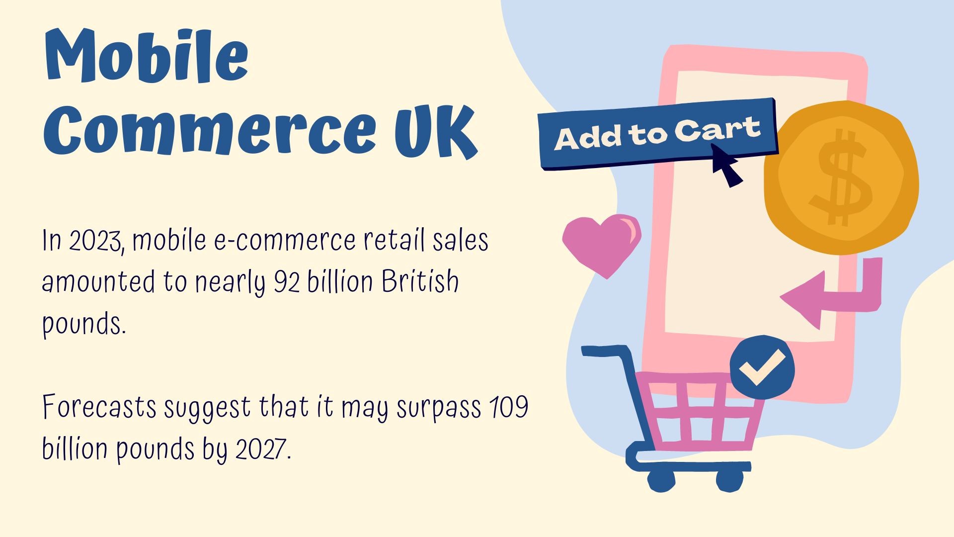
With so many people using smartphones, it is totally worth it to create mobile-friendly e-commerce solutions for your business. The swift pace of mobile phone adoption reflects how fast they are replacing desktop computers.
The aftereffects of global pandemics are also worth mentioning. They significantly changed consumer behaviour. People started to prefer online shopping over brick-and-mortar stores. These changes do not seem to go away soon. Statista reports that 60% of web traffic comes from mobile phones.
Benefits of Mobile Friendly Ecommerce Solutions
Businesses have realised that mobile-friendly websites are essential in attracting customers and generating sales. Missing this feature is equal to missing out on a large chunk of potential clients who use mobile phones for internet browsing. Here are some of the major benefits of mobile-friendly e-commerce software.
Enhanced User Experience
These websites ensure a clean and optimised experience for customers. They can enjoy the content they need without distractions such as pop-up ads or unnecessary clutter. One of the best perks of a mobile-friendly website is increased user engagement and satisfaction.
Looking for the right button or menu item is also not a user's headache. All they have to do is tap or swipe their way around it. Sharing information and communicating with each other is also easy in the mobile experience. Navigation is so intuitive that consumers find it very easy to browse the store and find the product they desire. Due to responsive design, they get a great view of the product before placing the order so they can make up their minds.
Users also use mobile phones to search for different products and services online. Once they find something, of course, they would not be willing to open another device to complete the purchase process. They would like to finish the process on mobile. So, having a mobile version helps e-commerce businesses maximise their sales.
Better Search Engine Optimisation
Mobile-friendly websites are great from an SEO perspective. SEO is the science that deals with making a website likable for search engines. Search engines rank the websites they find good for customers. So, if your website is SEO-friendly, more and more people will be able to see it in their Google searches. A mobile-friendly website is likely to rank higher.
Usually, mobile users type a keyword and click on the websites that they find at the top of the search engine result page. They do not prefer to navigate links. That is why mobile-friendly sites help generate traffic, and traffic increases the chances of sales. The huge volume of mobile searches makes it highly possible that your company will appear in relevant searches if the website is mobile-friendly.
More Customer Retention
Mobile-friendly websites also help reduce bounce rates. It refers to the percentage of visitors to a particular website who navigate away from the site after viewing only one page. So, the users who use the mobile phone for the first visit are more likely to come back.
In other words, a mobile-friendly website would help you achieve better conversion rates. Business of Apps reveals that mobile apps demonstrate 130% higher conversion rates than websites.
They may even return after purchase to learn about more products, enabling you to build long lasting customer relationships.
Key Features of Mobile-friendly Ecommerce Website
Responsive Design
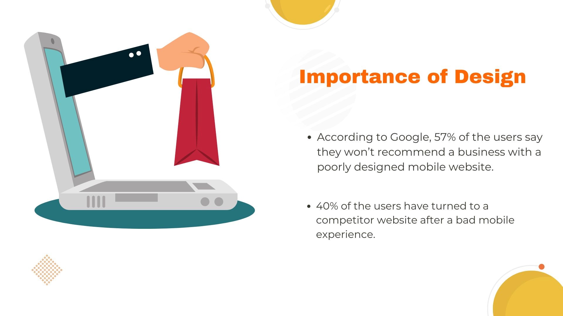
User experience should be consistent across all devices. Responsive design is all about your website looking good, no matter what type of screen your customer is using. They may be using a smartphone, desktop computer, or a tablet. The design should adjust to the screen size. So how you design a website determines how easily users find you.
Mobile Payment Integration
Since users want to complete the purchase on mobile, an e-commerce mobile app should include industry-standard payment features. The checkout process should be secure, efficient, and flexible. Flexibility here means that it should support types of mobile wallets.
Mobile Analytics & Insights
Mobile applications are also valuable resources for marketing insights. In this modern age, when the business landscape is highly competitive, you have to track your consumers' behaviour deeply to devise better strategies.
If they go out of touch or abandon their cart, you must pinpoint the exact reasons behind it. What are their pain points? At which stage do they go out of touch? What makes them feel negative about your brand?
Similarly, if they like a certain page of a product, you should know about it too. Which pages do they like, and where do they spend the most time? What is it that they like the most? Mobile e-commerce applications give you the full opportunity to track important metrics related to such stuff.
Speed Optimised
Speed is one of the most critical features in mobile-optimised websites. Slow websites have high bounce rates, which is something alarming.
Bounce rate is an important metric that shows the percentage of unengaged sessions on your website or app. The session couldn't last longer than 10 seconds, triggered a conversion event, or included a second pageview or screen view. It helps you understand how well your site or app attracts and retains the users.
Conclusion
E-commerce mobiles are 100% worth the effort and give results if you follow the best practices. They should load at good speed, have simple navigation and interface, and, above all, be mobile-friendly.
WoWcommerce offers efficient online store-building services with complete mobile optimisation. Get in touch today.